Barweer - Rome Corner Store - A clean, display-first modular with strong architectural presence
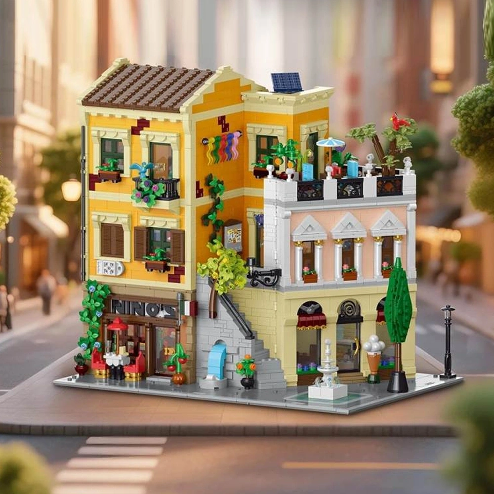
XMORK 10216 Rome Corner Store
A clean, display-first modular with strong architectural presence
After building enough modulars, you start to recognise patterns.
Some sets try to do everything — packed interiors, heavy storytelling, complex techniques, lighting, play features — all competing for attention.
This isn’t one of those builds.
The XMORK 10216 Rome Corner Store takes a different approach. It focuses on structure, proportion, and visual presence — and commits to that fully.
This is a display-first model. And importantly, it knows it.
If you want to check it out, you can find it here:
👉
https://www.barweer.com/products/xmork-10216-rome-corner-store-modular-buildings?DIST=Q0JAFFw%3D
First Impressions
Straight away, the model feels resolved.
There’s a confidence to the architecture — nothing feels overworked or forced. The proportions are clean, the lines are deliberate, and the European influence comes through naturally rather than being exaggerated.
It captures that street-corner presence really well.
What stands out most early on is the intent behind the design. The window framing, the wall structure, the way the building carries its weight visually — it all points in one direction.
This is about exterior composition. A display with an excellent aesthetic.
There’s no attempt to disguise that or balance it artificially with interior density. And because of that, the model feels focused.
Packaging – Needs Improvement
The packaging could definitely be improved. In my case, there was no inner box—just loose bags placed directly inside the shipping box. I’ve seen other examples of this same model packaged with a proper inner box, so this may have been a one-off issue, but it’s still worth noting.
On a positive note, the instructions were solid. They’ve clearly improved over time and were noticeably better than previous ones I’ve had from Barweer or Youmko.
There were a lot of separate bags for each stage of the build. Personally, I prefer to combine them into a single bag at the start, as that’s how I usually approach builds, but others may appreciate the step-by-step separation.
Since finishing this review Barweer have reached out regarding packaging. This was unique to this batch and used to facilitate distribution to the EU warehouse. I also note that the EU warehouse has a ton new stock. So Im less concerned about boxes generally but also if it speeds up stock in EU warehouse and keeps prices low we only win.
The Build Experience
The build follows that same philosophy — clean, structured, and consistent.
With 4500+ pieces split across 10 bags, the experience is well paced from the start. Each section feels contained, manageable, and intentional. You’re never overwhelmed, and you’re never waiting too long for something to come together.
There’s a steady rhythm to it. You are given little delight moments and rewards throughout.
Not slow. Not rushed. Just consistent.
Instructions are clear throughout, with no awkward steps or moments where things feel unclear. Everything flows logically from one stage to the next.
One thing that stood out to me in particular was the build order. That is extremely important. If you build the walls first, it becomes much more of a challenge to install the interior. I loved the decision to install the interior first. It means you get to enjoy all those little delight moments as each internal space comes together, and then later you get the satisfaction of enclosing it all within the finished structure. It’s a small sequencing choice, but it adds a lot to the overall experience.
Brick quality is solid:
- Strong, reliable clutch power
- Clean connections across structural sections
- No missing or damaged parts
- Minimal leftovers
It’s the kind of build you can sit with for hours without interruption. No friction, no frustration — just steady progress. It has a really nice rhythm to it.

Interior Detail
The interior is its key feature. It is extremely well executed, detailed and beautiful- but restrained.
Each floor is clearly defined:
- Ground floor restaurant
- Second floor jewelry store and lounge
- Third floor bedroom, bathroom, and terrace
- Ice cream parla and roof top garden terrace.
The layouts are logical and complete. Nothing feels unfinished or hollow.
But the detail level is controlled – well done but controlled. The colour across the board is a feature in itself.
With the exception of the restaurant, you’re not getting dense layering, heavy storytelling, or packed micro-detailing. Instead, the interiors feel clean, readable, and supportive of the structure above them.
They exist to complete the building — not compete with it.
That distinction matters.
Exterior Design & Presence
This is where the model fully comes into its own.
The exterior is brilliant.
The masonry work adds depth without becoming repetitive. There’s enough variation to break up surfaces, but not so much that it feels noisy. It gives the building weight.
The window framing is particularly strong. It defines the structure visually, creates contrast, and ties the entire façade together in a way that feels precise and intentional.
Then there’s the colour palette.
This is one of the more understated strengths of the build. The tones are well balanced, and the contrast — especially against the window framing — adds clarity to the design. Nothing blends unintentionally. Everything is defined.
It’s subtle, but it elevates the entire model.
At street level, the environmental details complete the scene:
- Trees and greenery soften the structure
- Outdoor tables and chairs add life
- Small touches that ground the building in a real setting
The solar panel is a small addition, but a smart one. It introduces a modern element without disrupting the overall aesthetic.
Taken as a whole, this is a building designed to be viewed — and it holds up from every angle.
Lighting
The lighting kit is included — but it’s intentionally simple.
Each floor gets a single light. No layering, no complex routing, no attempt to integrate the lighting into the structure in a meaningful way.
It’s functional.
There’s no concealment, no advanced installation, and no real design built around it.
But it works.
It adds visibility to the interior, gives the model presence in low light, and enhances the display without adding complexity to the build. It’s not a feature piece — it’s a supporting element.
Printed Elements & Finishing
This is one area where the set falls a bit short.
The model relies entirely on stickers — there are no printed pieces included at all.
I chose not to apply the stickers on my build, which gives it a cleaner, more neutral look, but it does mean some of the intended signage and smaller details are missing from the final presentation.
If you do apply them, they’ll definitely add more character and visual context to the building. But as it stands, this is very much a sticker-dependent finish.
Fortunately, the restraint sign is brick built and really nice.
Minifigures
No minifigures included.
Given the display-first nature of the set, it doesn’t feel like a major omission — but they would have added scale and a bit more life to the finished model.
If you want a display piece that wont matter so much, but if you are looking for play – the absence may be a little more strained.
Lighting
The lighting kit is included — but it’s intentionally simple.
Each floor gets a single light. No layering, no complex routing, no attempt to integrate the lighting into the structure in a meaningful way.
It’s functional. There’s no concealment, no advanced installation, and no real design built around it. But it works.
It adds visibility to the interior, gives the model presence in low light, and enhances the display without adding complexity to the build.
It’s not a feature piece — it’s a supporting element.
Negatives (Minor)
Interior detail is lighter than expected for the size, what
it does provide it does well, but ultimately there could definitely be more.
Lighting is basic and not integrated.
No minifigures.
That’s really it.
Ratings & Final Score
Detail: 7.5/10
Strong exterior work, more restrained interiors.
Design & Aesthetic: 7/10
Confident, balanced, and visually very strong.
Build & Execution: 7/10
Smooth, consistent, and well structured.
Overall Score: 7.5/10
Final Thoughts
This is a build that understands itself. It doesn’t try to compete in every category. It doesn’t overreach. It focuses on architectural presence, clean design, and display value — and it delivers on all three.
The result is a model that feels composed rather than crowded.
If you’re looking for something that adds visual strength to a modular street, this is an easy recommendation.
If you’re chasing dense interiors or heavy storytelling, it may feel a little restrained.
But for what it sets out to be — a clean, display-first modular — it’s executed with confidence and clarity.
And that’s exactly why it works.
The main thing I love about this model is THE VALUE FOR MONEY. This set will set you back $100 or £75. As Lego prices increase companies like Barweer and Youmko provide accessibility.


Comments
Post a Comment